Old portfolio
I have a long history of improving my portfolio, what can I say, tastes change. Fortunately, I keep these old portfolios so that I (and you too) can see how my taste has changed. So let's go through each variant step by step to what I have now.
My first portfolio
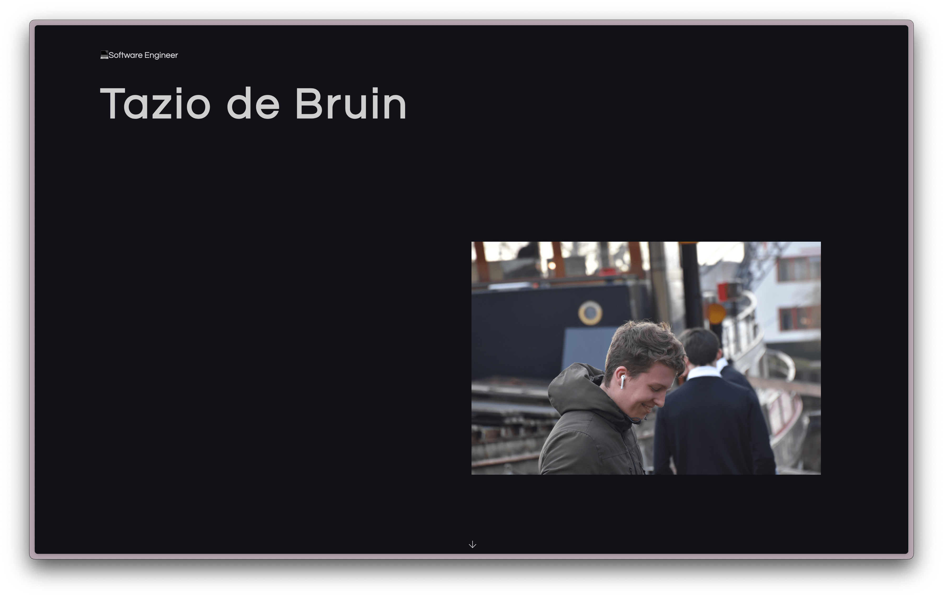
While I don't remember my thoughts and ideas about the style of the site, I am impressed that I added an animation that only runs as you scroll. I did this by using the wow.js library.
When I look through the code I see that I added special effects to your mouse during my birthday, winter, valentine and Christmas. Nice detail
I didn't have a logo at the time and didn't know what to use as an icon for my website, so I used a sleep emoji 😴 as a favicon.
The page is written in HTML & CSS, so I have a lot of freedom with what the visitor receives as code, I've left a quote at the top of the page for everyone:
<!-- /ᐠ. ᴗ.ᐟ\ -->
<!-- Hello ur currently inspecting the website -->
<!-- Just for your information... sometimes i also forget what i am doing here -->
<!-- -Tazio 2019 -->
https://tazio.nl/old/old/old/old/
Windows 1995
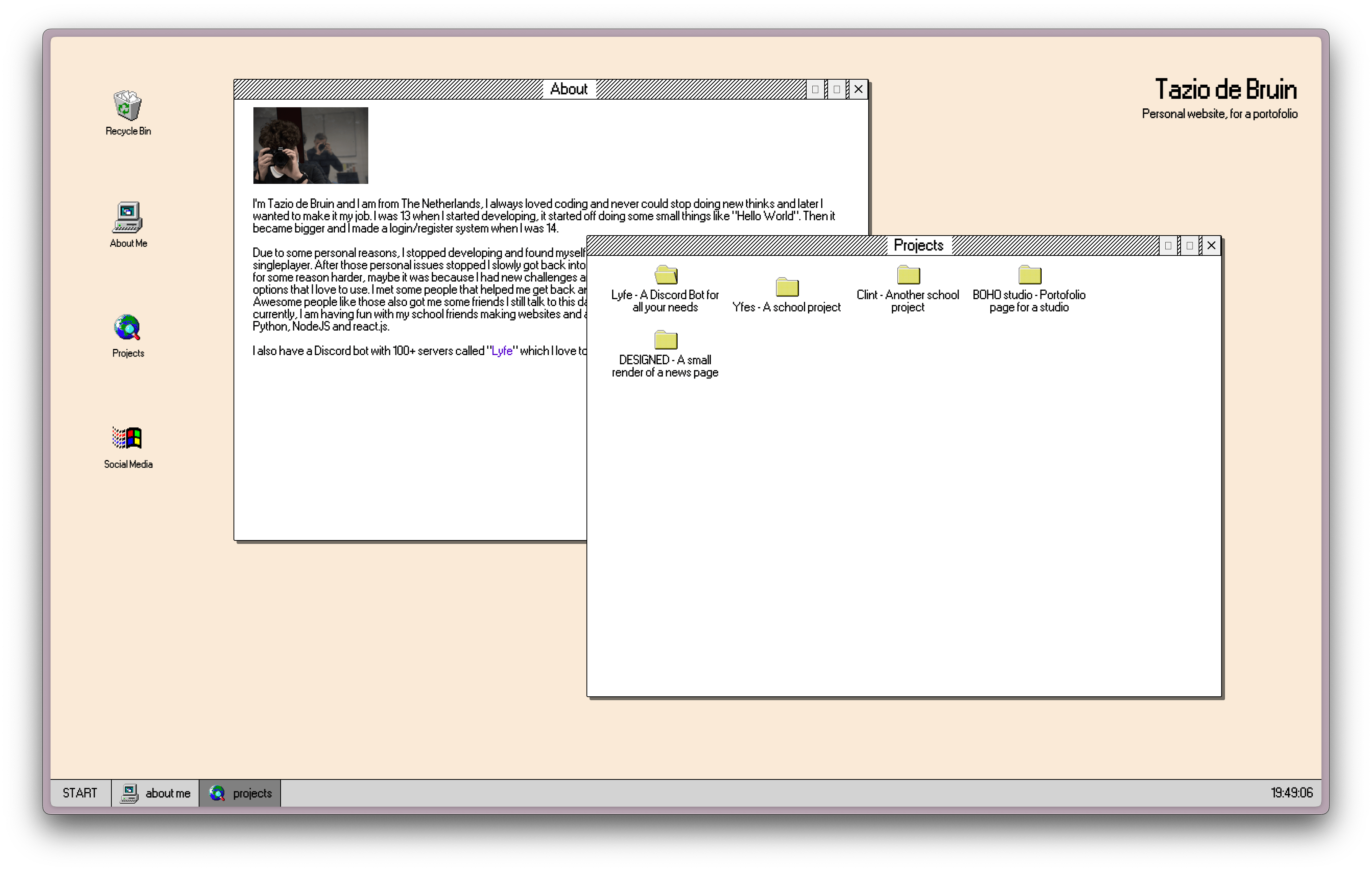
My friends love this one, it's a retro desktop! I've always wanted to experiment with dragging windows around a screen and teach myself some more JavaScript.
It keeps track of your open tabs, it has a depth level, even a terminal. My previous portfolio had a sleep emoji 😴 as a favicon. I did keep in line here by using a laughing emoji 😄. This was a fun project to develop and show. Because I used HTML tags, I was able to make it quite responsive with CSS, so you could also visit on your mobile.
<!-- /ᐠ. ᴗ.ᐟ\ -->
<!-- Windwos 95 is great -->
<!-- -Tazio 2020 -->
Only now I see that I spelled windows wrong haha.
Something brutal
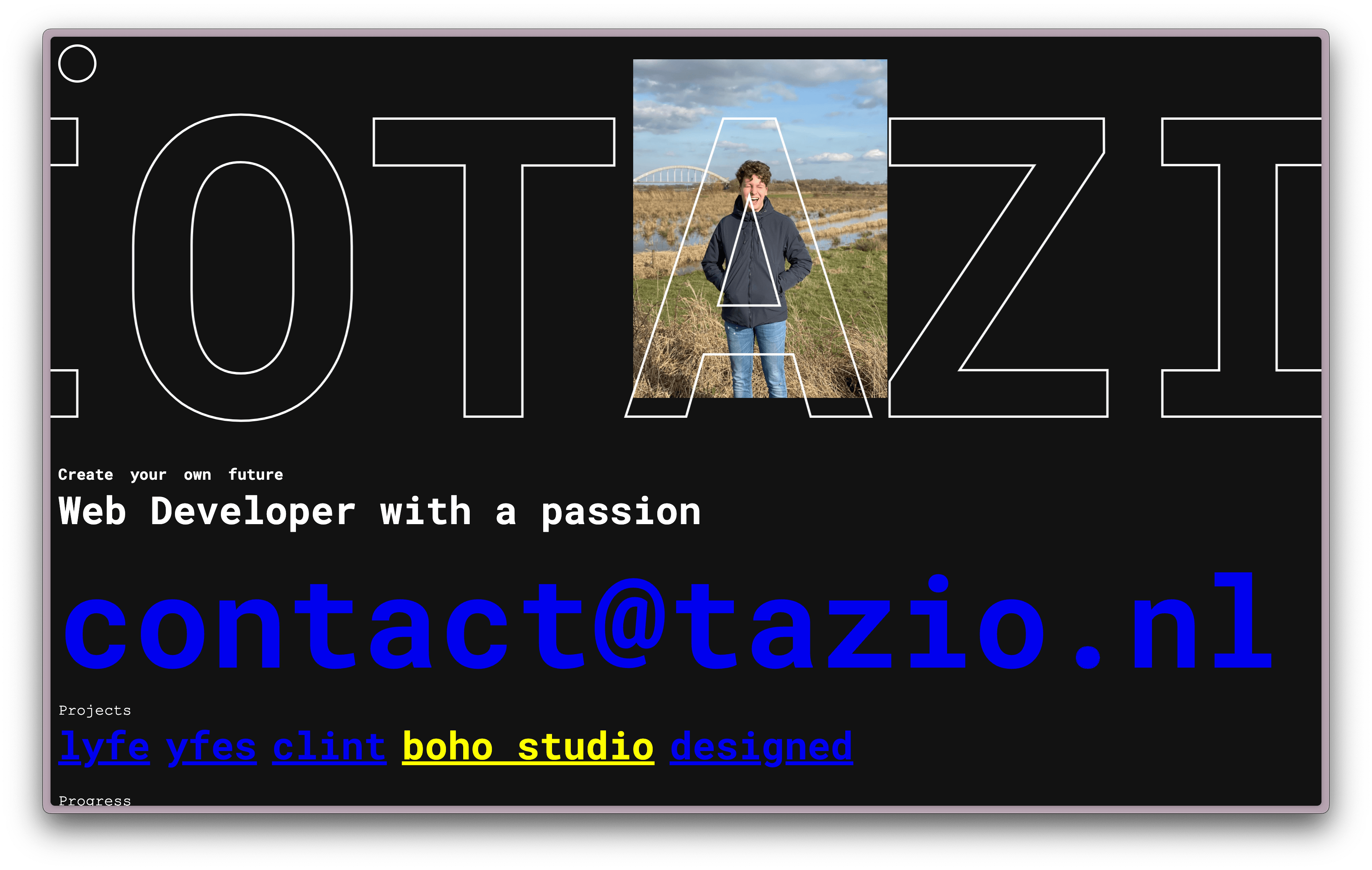
For this new edition of my style, I opted for something bold. I saw the outdated HTML element <marquee> online, and I thought it would be a great addition to a new website. Now that this is outdated, I have implemented my own variant in it. I have also applied the favicon idea again here in the form of a cookie emoji 🍪
I also added a secret little quest for developers who inspected my website. It contained a set of functions from script.js, now I forget the commands, so I can't tell you the ending. Also, a nice inspiring quote at the top of the HTML:
<!-- *                      * -->
<!-- * Creativity is step 1 * -->
<!-- *      just do it      * -->
<!-- *                      * -->
Very cute Tazio.
This was also the first portfolio where you could change the theme from dark to light modes by clicking on the circle at the top left.
Sideways
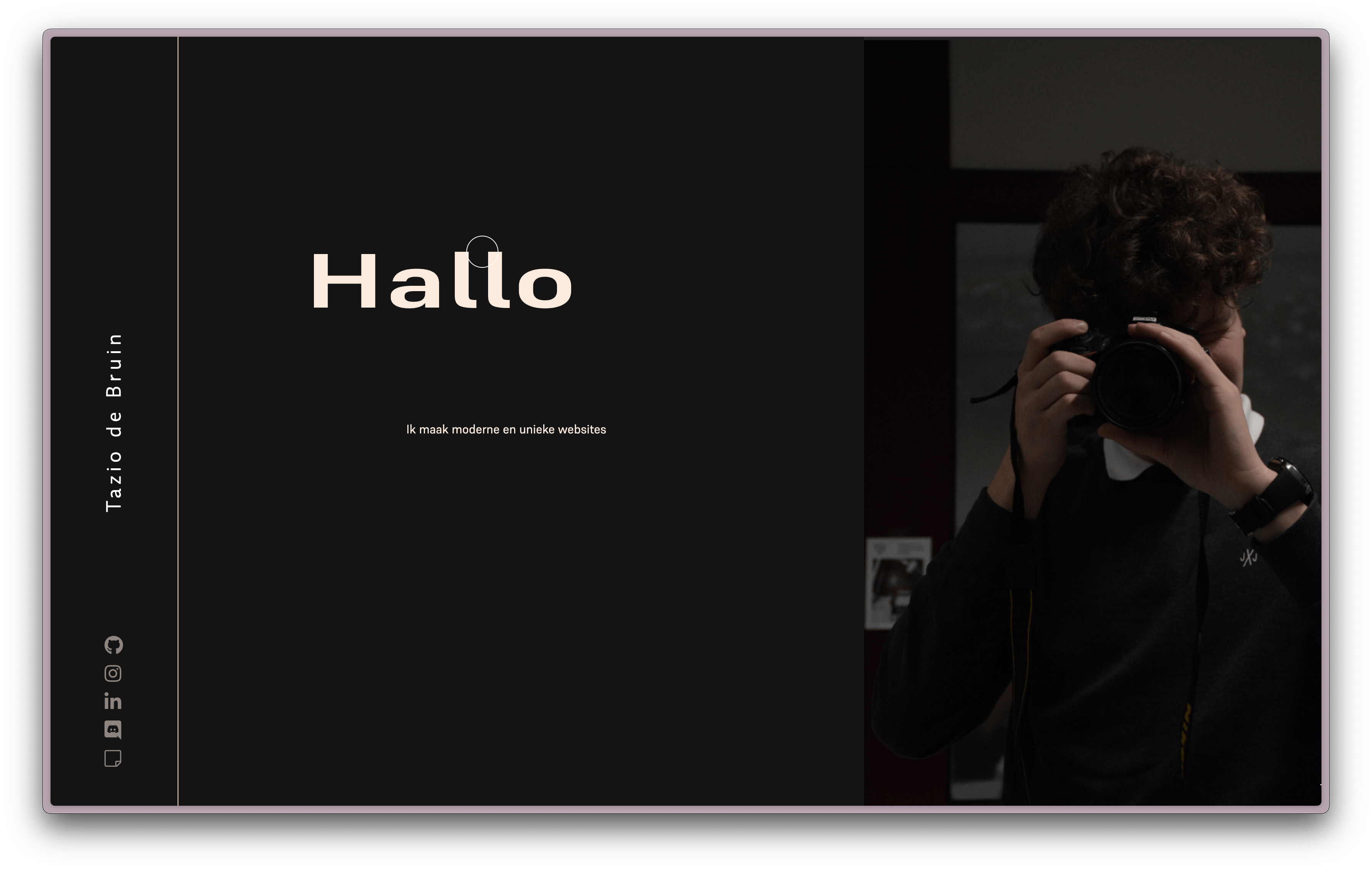
An impressive example of design. My idea for this portfolio was that you scroll down on all websites. Well, not my new portfolio, I thought. I'm going to do it sideways. Well, this posed a problem on mobile phones because the width of a mobile device is not the same as that of a desktop. So your mobile is like normal, you scroll down.
In that edition of portfolio, I chose a universe emoji 🌌 as a favicon. Elements from my previous portfolio also return here, namely the theme switcher circle as a circle around your mouse and the dark to light mode is now automatically controlled based on your device mode.
This was also the first project that had multiple languages and was also automatically switched based on the URL.
I changed the projects to a grid of 4, all four show a screenshot of the main page when you hover your mouse over them.
This was the first portfolio with a contact form, this form ran in a line together with the text and went like "Hello, I am ... and have a question about ..., email me back quickly at ..." which was the user could fill in and send. This was also the first portfolio with a loading screen from my active development year 2019 until now, I would have to stop this when I retire.
During corona, I added a new block at the end with "Stay safe during corona".
Current
And here we are, at now. I have chosen to choose something simplistic again that I can always add to later if necessary. This is also the first project where I use Kirby CMS 🤯. I chose this because of the simplicity at the back (panel) and that it does not require a database at all to operate. It uses YAML files to store data. This portfolio once again supports Dutch and English, so pages are now placed in specific folders with NL or EN.
This was a lot of fun to create and develop and with some help from the community I was able to launch this new portfolio.
I also recently had a lecture on accessibility for people with disabilities, where a blind man was also present and showed how he visited websites. This has given me a huge push to make my website accessible to people with disabilities. So I will be working hard on this in the background. For example, I created alternative texts for images for this blog.
Conclusion
As you can see, I have changed my mind quite often, but that only gave me more experience that I can use in projects for customers.
I have also noticed how important it is to have a stable foundation on which you can build. This was not a good thing at the beginning of my portfolio, and I tackled it well with my recent portfolio. I hope I can use and improve it for a long time to come.
